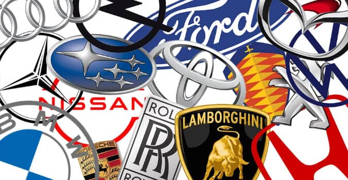
Emblems car brands for are of great importance. Available as a physical tool that is in the middle, although only in the minds of people who see the logo conjures up the image of the car from that brand. But these car brands logos, which have become so synonymous with a story will tell us how?
1. Logos Of Car Brands What Does It Mean?
With a story to tell emblems, car manufacturers, as they provide the reinforcement of the competition among the company is gradually increasing. Some people might think that these logos were intended to convey a meaning facile random or while actually behind them a deep rooted culture, tradition, mystery, and even from place to place can be found. The bride, the most famous car brands logos that belong to the emergence of the ones let’s take a look at the story!
1.1. Alfa Romeo Logo
The city of Milan of Italy was established in the upper segment of an automobile company, Alfa Romeo logo undergoing changes over the years became a little today. According to the story, the first idea of the emblem, the designer Cattaneo Romano comes in her mind while waiting for the tram. Cattaneo, Milan Biscione with the crest of the city of visconteo Filaret Tower in the Middle Ages are realizing the value of the family who manages the Visconti from Milan. The Alfa Romeo logo is also designed with this movement.
Alfa Romeo logo on the left side of the cross, the soldiers participating in the crusade is usually associated with the Milanese. The logo to the right of the Biscione also known as the snake and the snake of the family which is the symbol Visconti Visconti shows. This snake is assumed to be swallowed by a person in a crusade, defeated man.
1.2. Audi Logo
Audi, the German luxury car company, which was founded by August Horch in 1909, recognized as. The brand, the name in the German language, ‘listen’ to the Latin word, which means as Horch, Audi does not translate. In 1932, the company is merging with a different focus each with three different car manufacturer. And the Audi logo draw is also based on the nested consists of four rings.
1.3. BMW Logo
The origin of the BMW logo, 1913 Bayyera Motor Company in conjunction with BC. On the other hand, has ties to aviation of the brand in the past. BMW white blue swirling in the sky that are similar to the target mark of the emblem is thought to symbolize the propellers. Classic blue and white are the colours of Bavaria since at the same time, colors of this region, it is noted that it is preferred to honor this way.
1.4. Ferrari Logo
Rampant horse logo of the Ferrari symbol of Count Francesco Baracca comes from a famous Italian pilot who during the first World War. Next to the plane Baracca seen as a national hero by the Italian people, that includes prints of the same design. The horse is the symbol of the story after the death of his mother and father Baracca by the founder of Ferrari brand, Ferrari Enzo, it is recommended for you to use to bring luck. A yellow background the logo, The Color of the Italian city where Enzo was born; at the top of the logo red, white, and green lines represent the national colors of the country.
1.5. Ford Logo
Known for its simplicity, which showed only minor differences over the years, and Ford emblem reaches unchanged from 1972 to the present day. Logo, Ford chief engineer and Harold Wills in Chil’s being designed by the company’s founder, Henry Ford signature is based on. The white color means purity and clarity in the logo used in the paper.
1.6. Hyundai Logo
Hyundai logo large and in italics ‘H’ looks like a letter although it looks like, in fact, it is said that the two people who shook hands symbolize this sign. These two people is considered as a customer with the company representative. This means that there is a strong relationship between the automobile manufacturer and the customer.
1.7. Mercedes-Benz Logosu
Yıllardır üç köşeli yıldız sembolünü kullanan Mercedes-Benz, bu logosuyla şirketin karada, denizde ve havada hâkim olacak güçlü motorlarını temsil ediyor.
1.8. Peugeot Logosu
Peugeot aslanı, ilk olarak 1847 yılına Peugeot ailesinin demir çelik üretimi yaptığı evrede ortaya çıkıyor. Görüntüsü ve yırtıcı dişleriyle kuvvet ile keskinliği ifade eden aslan,1948’den itibaren markanın otomobilleri üzerinde de görülmeye başlıyor. Önceleri bir kafadan ibaret olan aslana, şirketin gücünü ve kurumsal dengesini göstermesi adına bir pati ekleniyor. Yıllar boyunca geliştirilen aslana 2010’da ise yeni bir hareket duygusu katılarak, daha sade ve dinamik bir görünüm sağlanmış durumda.
1.9. Porsche Logosu
Alman bayrağının renklerini içeren Porsche logosunun ortasında bulunan at, hızı ve şirketin bulunduğu Stuttgart şehrinin gücünü belirtiyor. At yetiştiriciliği yapılan Stuttgart’ın adı “damızlık çiftliği” anlamına geliyor.
1.10. Toyota Logosu
Intersecting with each other in the emblem Toyota ellipses symbolize the trust between the brand and its customers. However, the ellipses in Toyota’s logo, initials and also incorporates all the letters in the name of the company. The White area between the ellipses, it is stated that is an expression of Toyota’s unlimited potential for the future.
1.11. TOGG Logo
TOGG Car Turkey’s domestic auto venture group, which will be released by the brand, the logo of the year 2021 in the month of December had announced from the Twitter account of meaning. Accordingly, the meaning of logo, combining the two in the middle with octane action ‘the meeting of East and West, is expressed as the intersection of today and the future.
Togg logo, facing in opposite directions, similar to that used two pieces of software developers when writing code seems OK. This combination of the two arrows in the middle to form a shape that resembles a diamond. The selected color for the logo has made a submission to the Turkish world, it is known that turquoise.
1.12. Volkswagen Logo
World-popular German car brand Volkswagen emblem has a simple and quite catchy. Logo, German for ‘the people’ which means “Volks” and ‘cars’ meets the meaning ‘Wagen’ is a combination of the initials of the words is made up of letters W and V. These two letters enclosed in a circle if it is to be the brand that are important to ‘community’ and ‘inclusiveness’ which emphasizes the values of.

